Table of Contents
Outreach Program for Women User Interface Design Suggestions
Applicants planning to work on a User Interface should make a list of three ways a current interface in the Evergreen client could be improved, why each suggestion is beneficial, and documentation to solidify your position.
Julia Lima
About me
- Location: Villa Carlos Paz, Cordoba, Argentina
- Primary language: Spanish
- email: julia.lima.dg@gmail.com
- IRC: julialima
- More info: http://julialima.com.ar/eng.html
- OPW candidate for the Evergreen's UI style guide project
1st Improvement proposed: System feedback loops
The problem
Lack of system feedback loops for some user's actions in the Evergreen’s staff web user interface.
What are feedback loops?
The premise of a feedback loop is simple: Provide users with information about the result of their actions over the UI in real time. This information can be vital to the users because they can accommodate their future actions based on the feedback of actual actions, pushing them toward better behaviors.
Actually, feedback loops are not only a user experience design concept. They are a natural human process studied for decades and used in many fields. There are many natural feedback loops. They reveal to people whether they are making good or bad choices, and people learn from them. If someone eats something bad, they get sick. If they eat something good, it is delicious. If a person is nice to someone, and that someone responds in kind, the person feels good. If someone damages their body, it hurts. The brain has systems of reward and punishment that support basic survival.
In user interface design, feedback loops consist of a few simple steps:
- A user takes an action over the UI
- The action has one or more effects over different actors (like system itself, other users, etc)
- The important effects of this action are presented back to the user in the UI
- This loop is repeated regularly
Different actors who could produce feedback
A user performs an action over a UI, and that single action could produce different effects over different actors, just like:
- The system itself: For example, when a user clicks a button to save his work this action has a direct effect over the system itself. Then, the feedback showing the action's result should be given from the system to the user, closing the loop (user->system->user). This kind of feedback loops are also known as "system feedback loops".
- Another users: For example, when user "A" post content on a social network, this action has an effect over other users who will comment, share or like on that post, giving feedback to the user "A" and therefore closing the loop. Everything happens through the system, but the feedback is given from a user "B" to the user "A" (userA->system->userB->system->userA). This kind of feedback loops are also known as "social feedback loops".
- The physical world: For example, given a UI which controls a robot, a click on a button could be seen on a robot movement. The feedback is given from the physical world to the user, closing the loop (user->system->physiscal world->user). This kind of feedback loops are also known as "physiscal feedback loops".
Note: In this proposal I am only refering to system feedback loops (user->system->user).
The importance of system feedback loops
Feedback is an essential property of a usable product and necessary to avoid confused or frustrated users; it's critical for the user to naturally “flow” through the UI. For example, let’s say a user filled out a form in a web UI and hit submit. Nothing happens. The user hit it again. Nothing happens. The user proceeds to hit it multiple times and look around for some sort of message, but finds nothing. Maybe the page was just loading but there was no feedback to the user pointing that out, like a simple spinner. So now the user thinks that the application doesn’t work and gets frustrated. In this case a simple spinner could’ve corrected the user behavior by indicating him to wait for the page to load instead of keep hitting the submit button. The system feedback loop will guide a user pushing him toward better behaviors.
This concept is so important in design that great designers and organizations have taken it and converted it in a design principle:
- Don Norman’s design principles:
- Taken from his book: Preece, J., Rogers, Y., Sharp, H. (2002), Interaction Design: Beyond Human-Computer Interaction, New York: Wiley, p.21
- You can see the principles here
- Android design principles:
- The “Sprinkle encouragement” principle.
- You can see the principles here
- Apple OS X design principles:
- The “Feedback and Communication” principle.
- You can see the principles here
- Human factors standards, like MIL-STD 1472, require feedback and specify when and what types should be used.
How good system's feedback should be?
- On time: Nor after, nor much before the action's effect. The feedback must not confuse the user, quite the opposite it must clarify things. In such way it must be seen by the user as a reaction of his action.
- On target: It has two meanings. It means spatially associated with whatever input the user made, and it means wherever the user is attending. Usually these are the same thing, since users tend to attend to wherever they made their last input. However, when response times are slow, the user may have shifted attention elsewhere. In this case you may need two feedback signals, each with its own level of proportionality.
- Proportional: The feedback must be proportion to the user action. You generally do not want something obtrusive like a message box to tell the user everything worked fine. However the absence or loss of a signal or visual indication is generally not acceptable feedback
What about the Evergreen’s staff web UI?
Not all the Evergreen’s staff web UI has this problem, there are lots of user actions with its corresponding system feedback. Nevertheless, some critical cases remain uncovered:
| # | URL | Action | The problem | Improvement |
|---|---|---|---|---|
| 1 | https://webby.evergreencatalog.com/eg/staff/ | Login | After clicking the submit button there is no feedback indicating that the login action is being processed. | Spinner while processing |
| 2 | https://webby.evergreencatalog.com/eg/staff/circ/patron/bcsearch | Loading | When entering in this interface, the UI is partially loaded and the rest of it comes a little later. There is no feedback indicating that the rest of the page is being loaded. | Spinner while loading |
| 3 | https://webby.evergreencatalog.com/eg/staff/circ/checkin/checkin | Loading | When entering in this interface, the UI is partially loaded and the rest of it comes a little later. There is no feedback indicating that the rest of the page is being loaded. | Spinner while loading |
| 4 | https://webby.evergreencatalog.com/eg/staff/circ/patron/search | Loading | When entering in this interface, the UI is partially loaded and the rest of it comes a little later. There is no feedback indicating that the rest of the page is being loaded. | Spinner while loading |
| 5 | https://webby.evergreencatalog.com/eg/staff/circ/patron/search | Search | After clicking the search button there is no feedback indicating a search is being processed. | Spinner while processing |
| 6 | https://webby.evergreencatalog.com/eg/staff/circ/patron/search | Change page | After changing a page there is no feedback indicating the next is being loaded. | Spinner while loading |
| 7 | https://webby.evergreencatalog.com/eg/staff/circ/patron/search | Columns configuration | No column configuration feature gives feedback to the user. E.g the “Save columns” button, the “Reset columns” button, etc. | Little message indicating the action’s result |
| 8 | https://webby.evergreencatalog.com/eg/staff/circ/patron/search | Menu navigation | When navigating through the Patron search’s menu there is no feedback to the user indicating that a new section is being loaded. E.g when a user clicks “Check out” or “Holds” in the menu. | Spinner while loading |
| 9 | https://webby.evergreencatalog.com/eg/staff/circ/patron/2009/notes | Notes adding | After adding a note there is no feedback to the user while the note is being created. | Spinner while creating |
| 10 | https://webby.evergreencatalog.com/eg/staff/circ/patron/2009/notes | Notes deleting | After deleting a note there is no feedback to the user indicating that the note has been successfully removed. | Little message indicating that note has been deleted |
| 11 | https://webby.evergreencatalog.com/eg/staff/circ/patron/2009/notes | Notes deleting | After deleting a note there is no feedback to the user while the note is being deleted. | Spinner while deleting |
| 12 | https://webby.evergreencatalog.com/eg/staff/circ/patron/1/messages | Apply penalty | When applying a penalty there is no feedback to the user while the note is being applied. | Spinner while loading |
| 13 | https://webby.evergreencatalog.com/eg/staff/circ/patron/1/messages | Apply penalty | After apply a penalty there is no feedback indicating that the penalty has been successfully applied. This could be a problem in cases where the penalty is added in other table’s page that the user is not seeing. | Little message indicating that penalty has been applied |
| 14 | https://webby.evergreencatalog.com/eg/staff/circ/patron/1/messages | Edit penalty | After edit a penalty there is no feedback to the user indicating that the penalty has been successfully updated. | Little message indicating that penalty has been updated |
| 15 | https://webby.evergreencatalog.com/eg/staff/circ/patron/1/messages | Archive penalty | When archiving a penalty there is no feedback to the user while the note is being archived. | Spinner while loading |
| 16 | https://webby.evergreencatalog.com/eg/staff/circ/patron/1/messages | Archive penalty | After apply a penalty there is no feedback indicating that the penalty has been successfully archived. This could be a problem in cases where the penalty is added in other table’s page that the user is not seeing. | Little message indicating that penalty has been archived |
| 17 | https://webby.evergreencatalog.com/eg/staff/circ/patron/1/messages | Change page | After changing a page there is no feedback indicating the next is being loaded. | Spinner while loading |
| 18 | https://webby.evergreencatalog.com/eg/staff/circ/patron/1/messages | Columns configuration | No column configuration feature gives feedback to the user. E.g the “Save columns” button, the “Reset columns” button, etc. | Little message indicating the action’s result |
| 19 | https://webby.evergreencatalog.com/eg/staff/circ/patron/1/edit | Save | After clicking the save button the page is reloaded but there is no feedback to the user indicating that the account has been successfully updated | Little message indicating that the account has been updated |
| 20 | https://webby.evergreencatalog.com/eg/staff/circ/patron/1/items_out | Actions over item | No action over the items out gives feedback to the user. E.g the “Edit due date” button, the “Mark lost” button, etc. This could be a problem in cases where the table configuration doesn’t show the columns which contain the changed values. | Little message indicating that the action has been applied |
| 21 | https://webby.evergreencatalog.com/eg/staff/cat/bucket/record/view | Loading | When entering in this interface, the UI is partially loaded and the rest of it comes a little later. There is no feedback indicating that the rest of the page is being loaded. | Spinner while loading |
| 22 | https://webby.evergreencatalog.com/eg/staff/cat/item/search | Loading | When entering in this interface, the UI is partially loaded and the rest of it comes a little later. There is no feedback indicating that the rest of the page is being loaded. | Spinner while loading |
And maybe more…
Additional comments
This kind of high level interaction design problems can be avoided earlier by specifying a well defined UI style guide.
References
2nd Improvement proposed: Visual improvements
The problem
Across the Evergreen’s staff web UI there are issues coming from different sources depleting the user experience. What these issues have in common is that they are all visual.
Visual problem classes
Each single issue isolated degrades slightly the user experience. Together they have a much more significant effect and that is why I consider important to address these problems. In order to tackle all this I've organized the visual issues in three main categories:
- Lack of visual consistency
- Confusing UI elements
- Readability reduction by bad color treatment
By doing this I was able to analyze and attack each problem category individually. In the next sections I will explain and propose an improvement for each category.
Visual consistency
Visual consistency refers to the consistent use of key visual design elements such as color, typography, UI elements as well as spatial layout. A Consistent UI has many benefits:
- Makes UIs easier to use, because visitors don’t have to learn new tricks as they move around. In order words it reduces the slope of the UI learning curve which is one of the main "enemies" of the user experience.
- Provides reassurance for the users that they are still in the same place (same application).
- Gives an overall impression of professionalism and reliability, which is a key part in a business.
- When designing, removes the need to make the same decision time and again (for example, will our field labels be left-aligned or right-aligned?)
- When coding, enables the use of templates and pre-defined snippets of code.
This concept is so important in design that great designers and organizations have taken it and converted it in a design principle:
Lack of visual consistency in Evergreen Staff UI
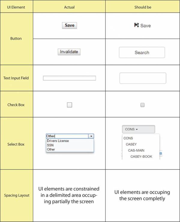
The following sections are inconsistent with the rest of the UI:
The sections' inconsistencies are listed above:
Confusing UI elements
There is a variety of UI elements that can look similar but serve different purposes for the user. As a rule, people don’t like to puzzle over how to do things. If people who build a UI don’t care enough to make things obvious it can erode confidence in the UI and its publishers. This is one of the rules that Steve Krug mentioned in his “Don´t make me think!” book. It is simple: people should not think when standing in front of a UI. Therefore, with a quick visual scan the user must be able to clearly identify the different UI elements and associate them to a specific functionality. This is why two different elements that look similar and provide different functions can confuse users and produce a poor user experience.
In the Evergreen´s staff web user interface this can be found in:
(https://webby.evergreencatalog.com/eg/staff/circ/patron/search)
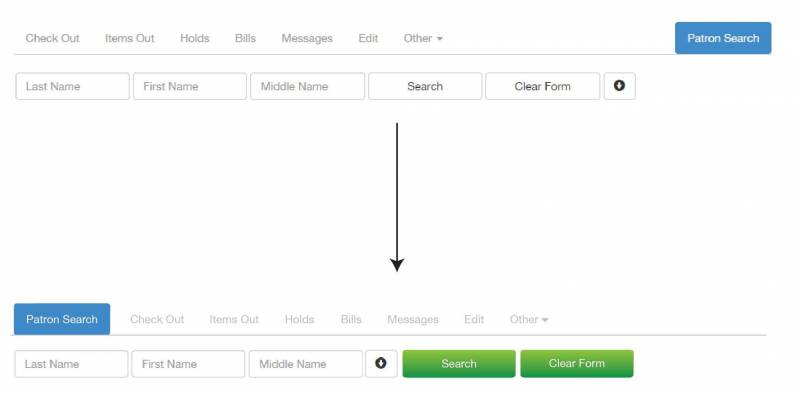
Both the “search” and “clear form” buttons have an alignment and format very similar to the search’s field. In such way those buttons doesn’t stand out and can be confusing. Once you complete the form the user could feel invited to click the “Patron search” “button” in the right-top-corner, however, that’s not a button, it is just the title of the section where you are in. This is another confusion, it is look like a button but is not, is only part of the subsection menu. This happens because that specific section is separated from the rest in the submenu.
This is my proposal in order to solve this issue:
Readability reduction by bad color treatment
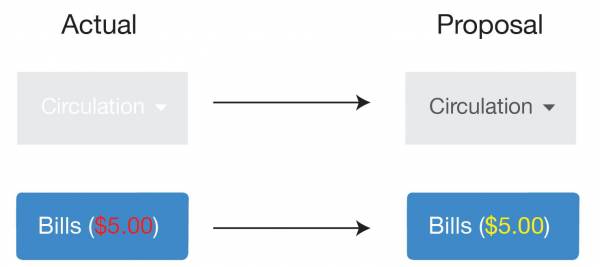
There are some text/background color combinations that the human eye find uncomfortable to read, e.g. text in red on a blue background or a text in any color on a colored-textured background, it always depends of how saturated each color is and the surface size. Therefore, knowing how to combine colors is essential for a UI in order to build a good user experience because it makes the texts easy to read. The Evergreen´s staff web UI presents readability problems caused by bad color combination in:
- The main menu: when clicking a tab
- The Patron Search UI’s submenu: when selecting a tab containing patron data (like bills and the number of items checked out).
In the following graphic I summarize a proposal for solving this issue:
I focused on reducing color contrast between text and background in order to produce a comfortable perception and improve readability. Although this may be seen as a little improvement, this has a real positive effect on the user experience, because these readability issues are in critical places which are very used (they are both in menus) and contain important user data (like bills for example).
Where all these problems come from?
The problems I have analyzed have a common root cause, the UI style guide. It may be the absence of it, an incomplete guide or even lack of effort of the development team in order to follow the guide. The thing is that a much better solution for all this visual issues is to focus on the UI style guide and force its usage.
A team needs to have a guideline to follow. This should be one of the first steps in the conception of a project: define the aesthetic, the color, typography, language and investigate which are the patterns and common usage of UI elements. Visual treatment is frequently the area in which developers will have most freedom of movement. However, once the designers have chosen a visual language, it’s important that everybody stick to it. Visual treatment applies not only to the obvious elements like logos and navigation, but also to content elements, fonts and backgrounds.
References
3rd Improvement proposed: Applying the progressive disclosure design pattern to the "Patron search" UI
The problem
The "Patron search" UI shows an unnecessary amount of features. Therefore this UI becomes very cluttered and complex which can produce confusion to the users and can make the application more difficult to learn, ending up in degradation of the user experience.
Patron search UI analysis
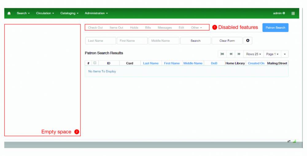
The "Patron search" UI is cluttered at the very beginning of any user flow, as you can see in the image below:
Regarding the points highlighted in the image, it is clear that there is unnecessary complexity added to the UI:
- Disabled features (1): There is an entire disable menu showed to the user. This means that the UI is showing the user features that may be available in the future. A better approach would be to show this features when they are available in order to maintain the UI simple and to keep the user focused on the main task which is search for a patron.
- Empty space (2): There is an empty space at the left of the search patron UI. This is actually saving space for the patron information but at this point the UI appears to be left aligned causing the loss of visual consistency. A better approach would be to show the patron information on demand, this is to say, when needed for the user.
Progressive disclosure design pattern
For UI problems of this kind, where it's wanted a very powerful interface, with many features, but it's also wanted to keep the interface as simple as possible, one of the best approaches is to apply the progressive disclosure design pattern.
Progressive disclosure is an interaction design technique often used in human computer interaction to help maintain the focus of a user's attention by reducing clutter, confusion, and cognitive workload. This improves usability by presenting only the minimum data required for the task at hand by sequencing information and actions across several steps in order to reduce feelings of being overwhelmed for the user. By disclosing information progressively, you reveal only the essentials and help the user manage the complexity of feature-rich applications. Progressive disclosure follows the typical notion of moving from "abstract to specific"; only it may mean sequencing interactions and not necessarily level of detail (information). In other words, progressive disclosure is not just about displaying abstract then specific information, but rather about 'ramping up' the user from simple to more complex actions.
The great designer Jakob Nielsen describes the progressive disclosure pattern with two simple steps:
- Initially, show users only a few of the most important options.
- Offer a larger set of specialized options upon request. Disclose these secondary features only if a user asks for them, meaning that most users can proceed with their tasks without worrying about this added complexity.
In its most formal definition, progressive disclosure means "to move complex and less frequently used options out of the main user interface and into secondary screens".
My proposal
There are several ways to apply the progresive disclousure pattern in a UI. Based on the actual "Patron search" UI I consider that the best approach is to use the dynamically-growing UI technique. By applying this approach the UI will progressive discover the features to the user by expanding itself. This approach has the following benefits:
- The users can form a correct mental model of the task quickly and easy.
- There are none of the awkward context switches that separate screens impose.
- Since the UI is kept together on one page, the user can very easily go back and change their mind about earlier choices;
- The users immediately see the effect on subsequent steps.
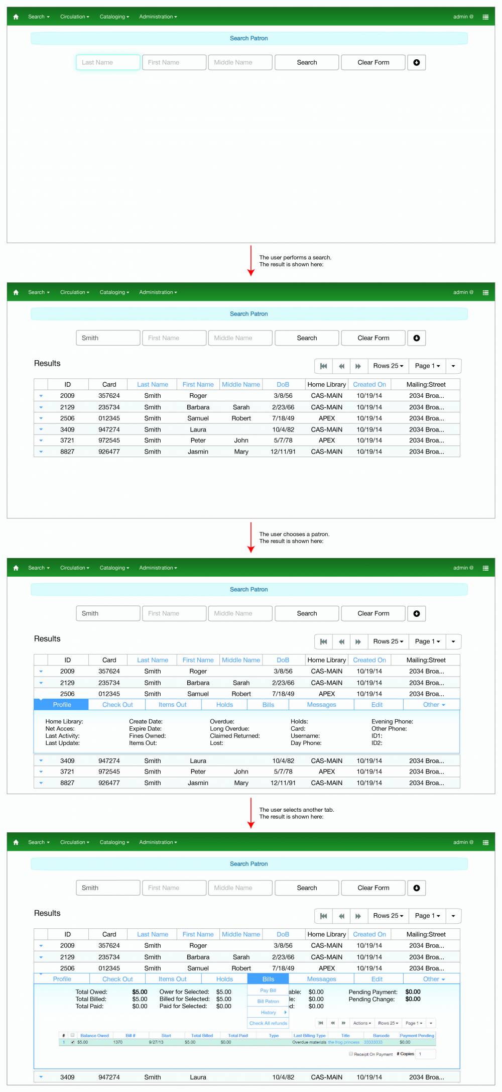
Below I show an image with my proposed designs:
This image shows a general idea about how the progressive disclousure pattern could be applied in the “Patron Search” UI. I am not considering a full UI design with all the possible options or cases in it.
Additional comments
This kind of low level interaction design patterns applied to specific but central features are often specified in UI Style Guides. This highlights again the importance of having a well defined complete UI Style Guide for an organization.

