Table of Contents
Landing with Perfect Form: design proposal for Evergreen’s staff client interface
The work of librarians adds immeasurably to the quality of public life and a growing number of them rely on Evergreen to make efficient use of their time on the job. The Evergreen staff client needs an interface that allows its users to find the services they need quickly and then use them with ease. I propose to contribute design in three key areas of the staff client interface– the home page, the form and language/iconography– and capture the principles behind the design in a Style Guide for future contributors to the project.
I have included an Outreach component to my application in order to encourage other women to do make the leap into open source. I also make a few mentorship requests to make sure my time in the Program sets the stage for a long career contributing to open source software.
About the Designer: Micaela Neus
I’m a self-taught UX/UI designer looking to put formal design experience on my resume while contributing to a worthwhile project.
Design is my third career. My formal background is in literature and arts and I came to San Francisco in 2004 as a professional Sound Designer for theater. I spent 2007-2012 working for the US Antarctic Program as support staff (read my 2011-2012 blog) for scientific research at McMurdo and Palmer Station. I began studying code and UX design in early 2014 in order to code the first website for a non-profit I founded called Open Antarctica, which I continue to develop.
While learning with HTML, CSS and introductory Javascript/jQuery, I discovered that my education in performance design inadvertently prepared me for a career in user research and interaction design. Intrigued, I took a class on human-computer interaction with Coursera that got me really excited to work on a live project. The Outreach Program for Women came to me at the perfect time. As a lifelong self-educator indebted to public and academic libraries, I’m especially excited to participate as an Evergreen contributor!
Objectives
I drafted these design proposals with an explicit goal: to ensure my 3-month internship would benefit the long-term development of Evergreen. This desire led me to three key considerations:
1. My contributions should focus on foundational design elements common across all views. The client will continue to evolve new features forever and the Evergreen Style Guide exists to safeguard a sense of continuity in UI/UX as functionality changes.
2. My proposals must support Evergreen’s growth and inclusivity by finding places within the UI to reach out to users. Evergreen is a project on the move– 1000+ known systems and counting! Who knows who will want to use it next? Design must anticipate big stuff to come.
3. My work should be completed within the timeframe of the internship. Scoping a project is always a challenge but by directing efforts toward a Style Guide, we can dream about new features without feeling pressure to implement them all. They simply go on a feature list for future contributors.
Design examples drawn from https://webby.evergreencatalog.com/eg/staff/
Part 1: Home Page
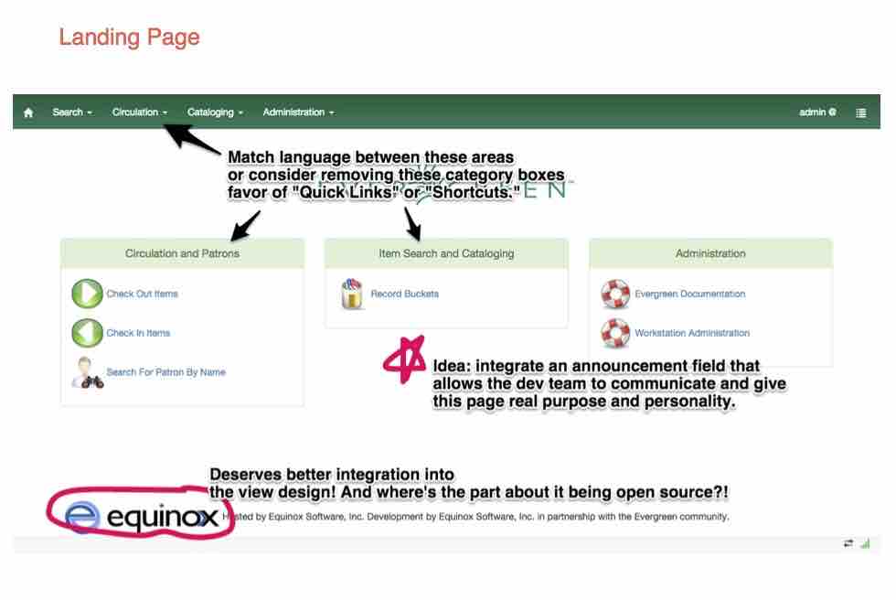
The home page presents us with two unique opportunities: to “shortcut” the user to common functionalities and to seize the chance to “update” them about Evergreen or other relevant topics before they begin working. Currently, the home page takes advantage of only the first. I propose a few changes to the shortcuts (see annotations on the screenshot) and the addition of a dialog box that Evergreen could use to make announcements to users.
Part 2: Form Design
Client users complete their tasks in Evergreen almost exclusively through a single method: the form. These forms often correspond to tables, and both of these might be populated using a barcode scanner. It follows that a standard of clear, concise form design that closely matches any related tables will make the application more intuitive and navigable now and in future releases.
A few elements of form design to consider:
- visual hierarchy reflected in heading values
- adequate spacing and scan line lengths for legibility
- color coding that meets accessibility requirements
- consistent navigation between form views (e.g., tabs vs. links)
- feedback elements (buttons change color, etc.)
- what info to show, what to hide until requested
- on-screen placement stays consistent between views
The following annotated screenshots depict my initial response to some views within the staff client as retrieved in mid-October:
Tables:
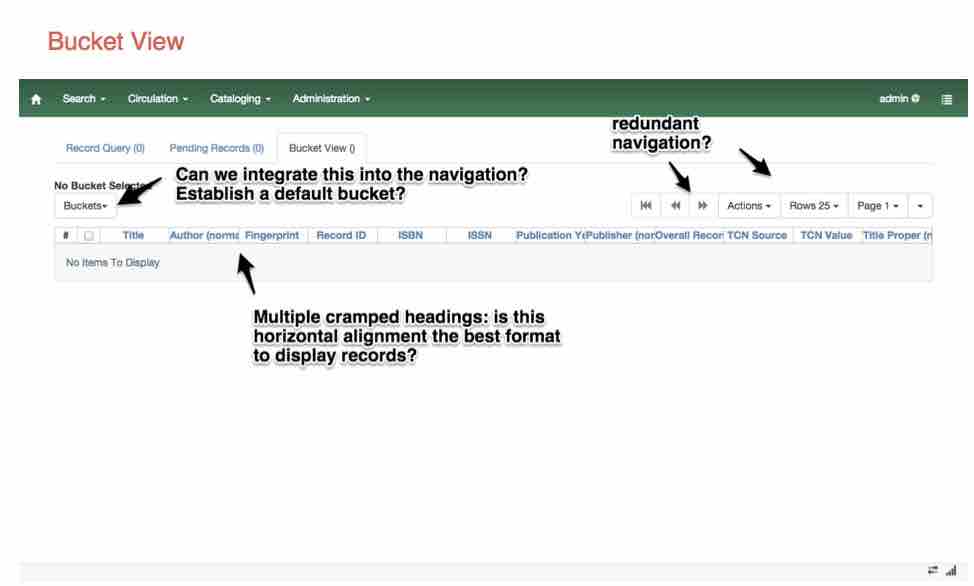
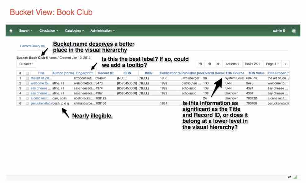
Bucket View provides a good example of some of the table weaknesses. The headings are truncated and the heading hierarchy is muddled.
Input Forms:
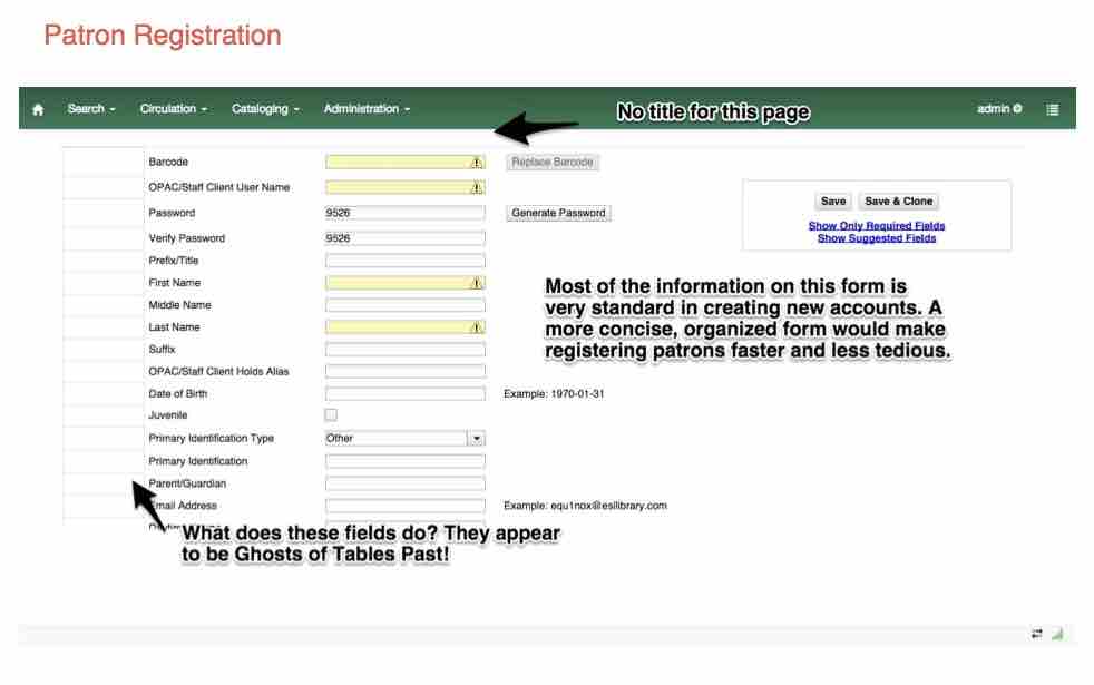
Registration is a common and tedious task in today’s society. How could we expedite the process for librarians and patrons by redesigning the registration form? Using techniques like Address Autocomplete from the zip code and revealing information as needed (e.g., hide Parent/Guardian fields until Juvenile is checked) might reduce completion time significantly.
Checkin/out:
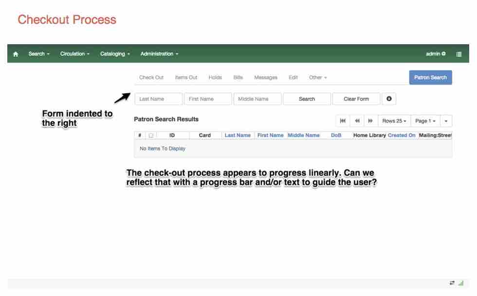
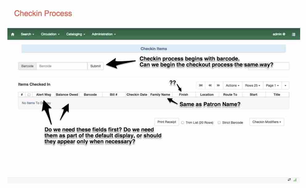
Another frequent activity is checking materials in and out of the system. Without a barcode scanner, I had limited power to explore these forms. Still, I see places where we could eliminate distracting inconsistencies between the forms and prioritize the information displayed that might make this process flow more smoothly.
Search:
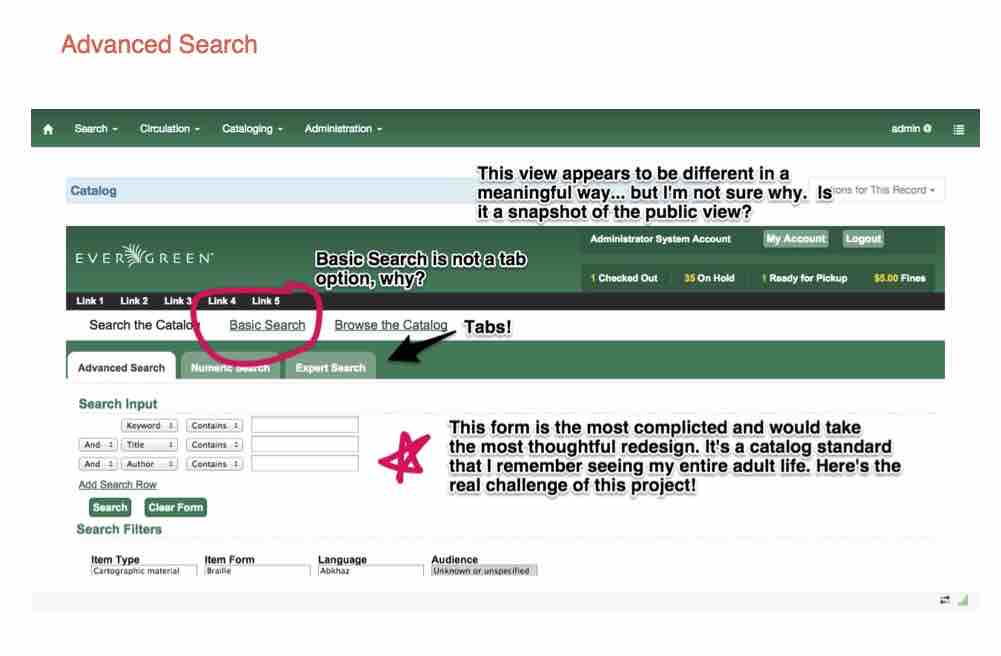
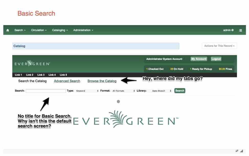
The most important– and tricky!– design elements would be the search forms. I barely want to comment on these forms until I could do more research and get feedback from librarians. Here, I present my first impressions.
Part 3: Language and Iconography
Today’s web user practices various “wayfinding” techniques to locate information online. Research has shown that most users practice “scanning” for textual cues in order to find their desired information. They also take advantage of icons to get to common tasks, as long as the icons are well-designed. Icons also support ESL users navigate the site and makes the site more consistent across translation.
Clearly, how we label and identify elements of the interface makes a strong impact on an application’s ease-of-use.
I propose taking a thoughtful look at how things are labelled within the staff client to ensure clarity and consistency across all views, along with the introduction of some iconography. Icons must be added carefully to ensure accessibility and avoid cluttering up the screen. To that end, I suggest using a symbol or icon font judiciously to label basic activities such as registering a new patron. As a supporter of all things open source, I specifically want to investigate Entypo as a leading candidate for Evergreen’s icons.
Part 4: The Style Guide
As we work to create and implement design standards across the interface, we should capture them for future contributors to both Evergreen and other open source projects that rely on forms (a designer can dream, can’t she?). New standards should appear on the wiki for general comment and sharing with other open source projects.
Ideally, I would include a section of the Style Guide that gives suggestions for future improvements to the UI/UX (such as the bonus features in following section) so that more designers can contribute to Evergreen.
Bonus: Tooltips & Animations
I have outlined enough work for three months, undoubtedly… so why stop there? If time allows, I would like to incorporate tooltips to orient both new and experienced Evergreen users to the client’s functions. Certainly, I would include tooltips as a desired feature in the design section of the wiki.
Animations have the ability to enhance an application’s sense of smooth interaction and general “aliveness.” Users are coming to expect some level of animation these days. I do not know how or where I would integrate animation into the design, but it’s fun to think about.
Outreach
I know firsthand the value of community in bringing women to tech– without it, I wouldn’t be here! I had a crazy idea for Open Antarctica that never would have gotten off the ground without organizations like Women Who Code and Girl Develop It, and I attended my first ever tech conference on a discounted ticket to Google I/O offered as part of their diversity crisis. Fellow members of Double Union not only brought the Outreach Program for Women to my attention but encouraged me every step of the way, offering technical and professional advice. I intend to give back!
I will write about my experience in blog posts, naturally. I’d also cross-post them on Medium.com and other public sites. I would give several talks around the SF Bay Area on topics such as the experiences of women in open source, how to make your first pull request, etc. Then I will publish the slides on Slideshare. Seeing others accomplish their dreams is proven to help you do something similar. Outreach matters, outreach works!
Mentorship
As an early career professional, I need more than knowledge about the technical requirements of contributing to open source and being a member of a development team… although I need that too! In participating in the program, I’m looking for critical feedback on my skills and suggestions for improvements. A good mentor would help me translate my achievements with Evergreen into my portfolio and CV to advance my career.
Timeline
Weeks 1-2: Discovery
- Integration into Evergreen workflow
- Explore the application in more detail
- User research
- Sketching and feedback sessions
- First Outreach post!
- Milestone: finalize feature list and scope of design project
Weeks 3-4: Wireframes and first commits
- Sketches evolve to wireframes
- Feedback and review
- Outreach post documenting design process in open source
- Milestone: First edits to wiki and commits to codebase
Weeks 5-10:
- Implementation
- Work through feature list
- Feedback sessions
- Continue to update Style Guide on wiki
- Outreach post about making commits to open source code
- Outreach lightning talk?
- Milestone: Core interface elements deployed consistently across site
Weeks 11-12: Tweaks and Edits
- Final design tweaks as required
- Final edits to Style Guide
- Work on Bonus features, beginning with tooltips
- Portfolio and CV updated
- Milestone: Style Guide published, champagne popped!
Conclusion
Thank you for reviewing my UI/UX design proposal for Evergreen as part of the 2014 Outreach Program for Women. In emails and on IRC, the Evergreen community has been hugely welcoming and supportive. Regardless of your decision to accept me as an intern, I will remain an admirer of this project and the people who make it happen. Thanks!
