Table of Contents
Samadrita Das
About me
- email: samadrita.das1993@gmail.com
- Primary languages: English, Hindi
- Portfolio: www.samadrita.info
- IRC: sdas
- OPW candidate for the Evergreen's UI style guide project
1. First Improvement: Visibility of System Status
Problem
The current interface in the Evergreen client lacks the visibility of system status. In Jakob Nielsen's words "The system fails to keep users informed about what is going on, through appropriate feedback within reasonable time." Visibility requires that users stay informed about where they are in relation to other pages on the site. This allows them to have a mental map of the site and easily navigate both to new pages and ones visited previously.
Detailed issues in Evergreen staff web UI and my proposals.
Probably the two most important things that users need to know at your web are "Where am I?" and "Where can I go next?"
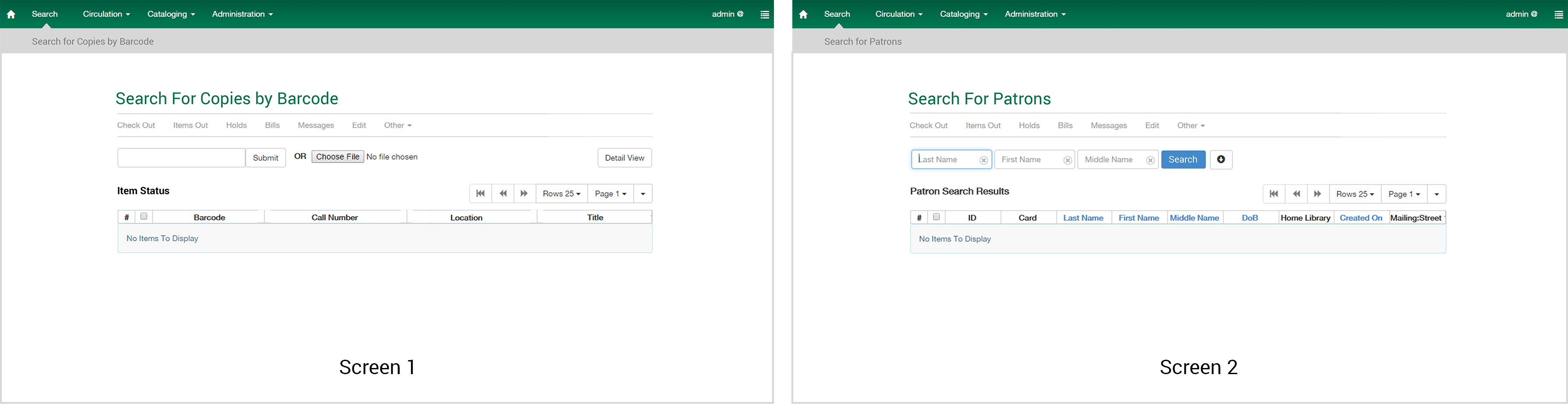
1.1 No clear Heading
  Every display should begin with a title or header that describes screen contents. Readers rely on page
  titles and headings to navigate websites and understand what is relevant and valuable
  {{:opw:ui_suggest:1.1.xlsx|}}

  The red indicates No heading, Green indicates heading and orange indicates pages having non
  consistent heading. Heading is also important from the point that a user need not remember any information
  ie he/she is not under any sort of cognitive load while navigating. This not improves ease but also
  improves their efficiency.
  urls's from 1-14 are from Circulation Category while 14 and 15 are from Search Category and 16 is from
  Cataloging. This brings us to the next part of the problem.

  References:
  [[http://www.stcsig.org/usability/topics/articles/he-checklist.html]]
  [[http://meetcontent.com/blog/introducing-content-page-titles-headings/]]
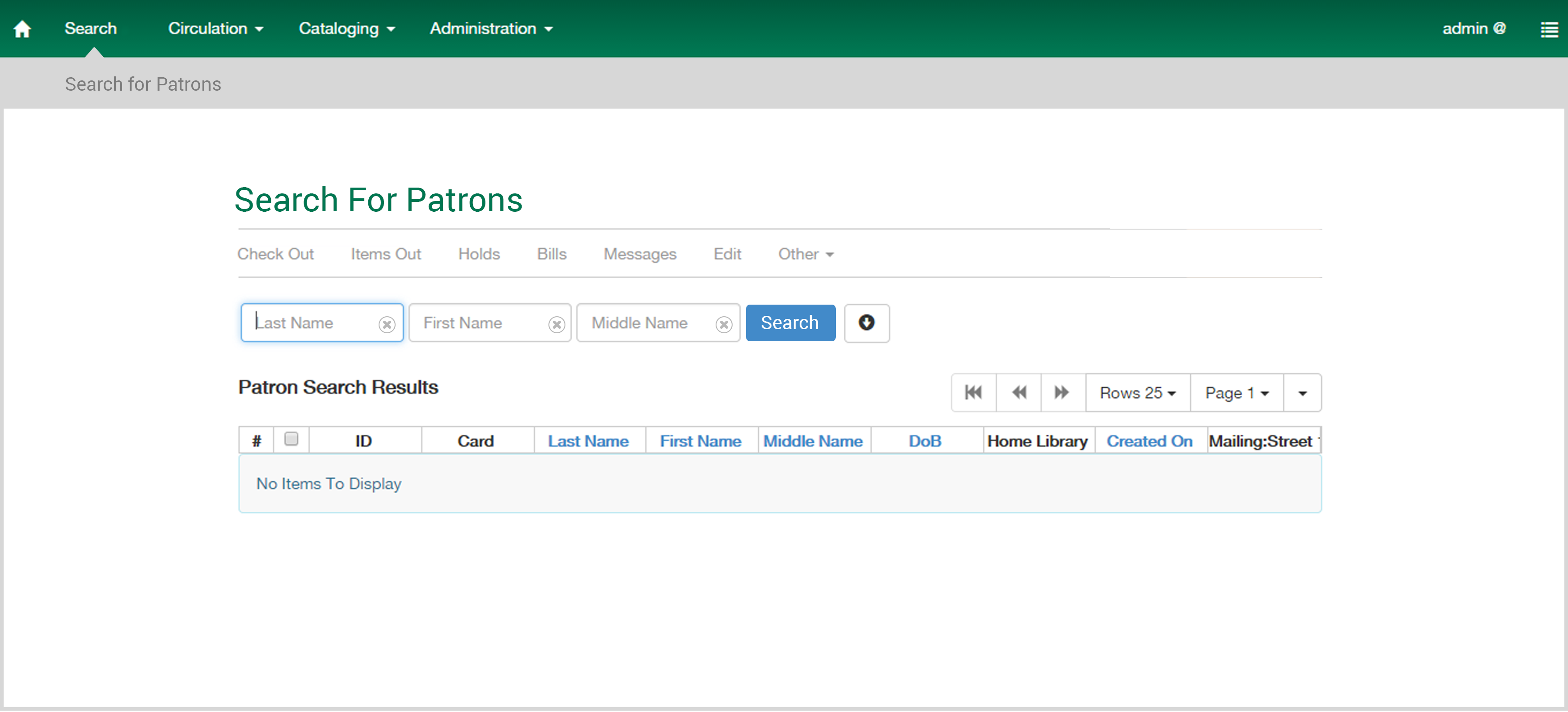
1.2 No indication of the current state of the user.
  A user should be always be informed about where he currently stands in the system.The system can use
  context labels, menu maps, and place markers as navigational aids to improve the experience and reduce the
  cognitive load of the users by preventing them to remember information. I would propose the design to be
  similar to this.
  {{ :opw:ui_suggest:breadcrumbs.png?nolink&3508 |}}

  References:
 [[  http://www.smashingmagazine.com/2011/06/06/planning-and-implementing-website-navigation/]]
 [[ http://www.nngroup.com/articles/breadcrumb-navigation-useful/]]
2. Second Improvement: Consistency and standard
Problem
The web ui of evergreen staff doesnt follow a consistent and coventional standard throughout.
The consistent display of information requires that the system dependably use standard formats, fonts, line spacing, letter spacing and page lengths when displaying relevant information. The same information should appear in fixed places across all screens. Keeping a website (or interface of any kind) consistent makes the user feel more comfortable. When the page-to-page navigation retains the same layout and style, the user feels less like they're jumping around between different pages and more like they're staying within a uniform location
References: http://www.nngroup.com/articles/ten-usability-heuristics/ https://sbmi.uth.edu/nccd/ehrusability/design/guidelines/Principles/consistency.htm http://www.mattsoave.com/old/cogs187a/iu_site_eval/4consistency.html http://www.sitepoint.com/why-consistency-is-critical/
2.1 No consistent layout
A very small example of difference in layouts in evergreen is given below followed by make take on the design.

Design I propose is much more more consistent with fonts and layout. It has a clearly defined page heading and the entired content is center aligned.
2.2 Laying emphasis on Affordance
Problem
Similar looking buttons triggers separate functions.
An affordance is often taken as a relation between an object, or an environment, and an organism that affords the opportunity for that organism to perform an action. In other words, an element should be able tp communicate its function to the users
In the following proposal I have made changes in the search button because earlier both search and clear options resembled the look and feel of the text fields. This resulted in lot of errors because users might mistaken it for a text field. Hence the change in design was necessary.
I have introduced a bright blue button for search. A quick research indicated that text is more effective than icons. Hence I refrained from using a magnifying glass. Moreover I have also used cross buttons for individual text fields instead of one button that clears the entire form
Reference: From the book Design of everyday things by Don Norman.
3. Third Improvement: Increasing Efficiency
User experience is not just guided by the effects users undergo while interacting with a system, product or a device but also by its usability. An important aspect of usability is efficiency which targets to improve the productivity of the user.
Problem
Staff members at evergreen has to go through lot of data. In the current system, there is no way that facilitates quick overview of this data. In order to access information about bills, one has to individually go through each patron's account. This process is not just time taking but may also result in erroneous results.
Following proposal aims to increase the efficiency of the staff.
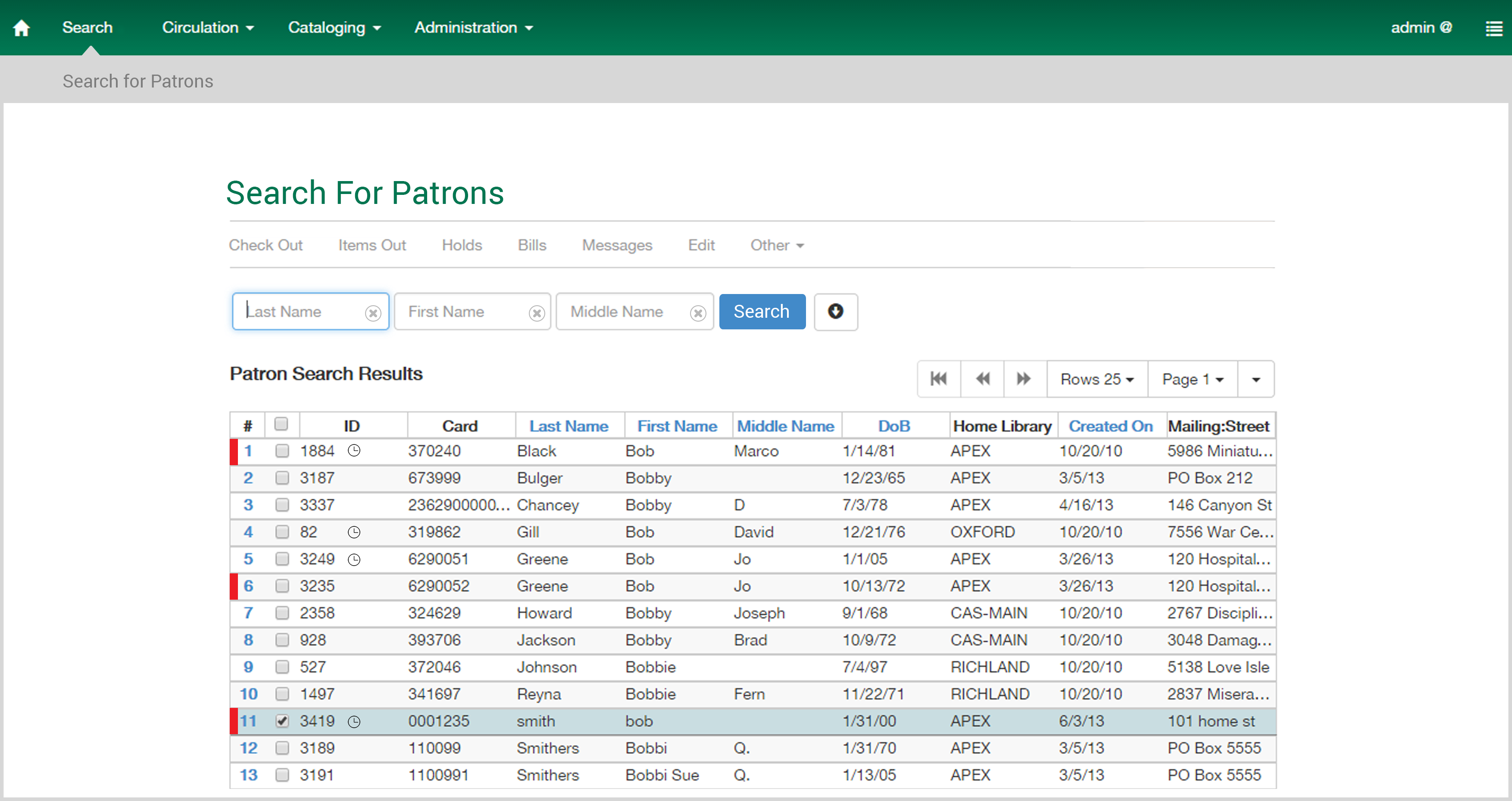
The red strip which draws a lot of attention, quickly tells you that the marked patron has fine against him. The clock next to the ID displays that the expiry date is nearby. These small hints can save a lot of time since the user can access a lot of information right in the first look of the list.
Reference: From the book About face 3.0 by Alan Cooper, http://www.affordableusability.com/usability/efficiency.html
Some of the other recommendations would be to create a separate category for registering, retrieving, renewing and other specific patron related tasks so that these can be easily accessible.